Blog Categories
Web design Branding Blogging Social Media Inbound All
We post weekly tips, tricks, and marketing advice to help grow your business.

How To Start A Newsletter
A newsletter is a great way to stay in front of your clients, fans, and followers. Whether you’re running a special promotion or have a few new blog posts you’d like to share, a newsletter is the perfect vehicle to recap all the latest and greatest things you have going on in your business. In today’s post, we’re going to walk you through the basics of starting a newsletter.

A newsletter is a great way to stay in front of your clients, fans, and followers. Whether you’re running a special promotion or have a few new blog posts you’d like to share, a newsletter is the perfect vehicle to recap all the latest and greatest things you have going on in your business. In today’s post, we’re going to walk you through the basics of starting a newsletter.
Decide on a schedule.
If you want to start a newsletter for your small business, you’ll have to commit to being consistent. Just like with a blog, once you send out your first newsletter, your audience is going to expect to regularly hear from you. Don’t let them down by being inconsistent. Devise your game plan up front and create a publishing schedule that you can reasonably manage. Once per month. Once per week. Whatever it is, just be sure you can adhere to it.
Plan your content ahead of time.
There’s nothing worse than scrambling to throw together content at the last second. If you’re going to commit to running a newsletter, you’ll have to organize your content and plan ahead. If you’re publishing a monthly newsletter, you should develop your topics and content a month in advance. Look at what you’ll be posting on social media and your blog and flesh out the substance of your upcoming newsletter from there.
Pick a platform.
Ok, let’s talk tech. There are many different email platforms available out there. And quite frankly, you should use whatever one you’re most comfortable with. However, some things you might want to look for in an emailing software are:
Responsive templates
Design flexibility
Ability to segment your contacts
Opt-out management
Automation
Reporting tools
Customer support
Familiarize yourself with your email software.
Make sure you’re completely comfortable using all aspects of whatever email software you decide upon. Play around with it ahead of time and tinker around with the design tools. You definitely won’t want to be fumbling around on the day your newsletter is supposed to launch. Outside of actually designing the newsletter, you’ll want to know how to create your email distribution lists and then how to analyze the results at the end of each campaign.

Feeling frantic is fun…
Said no one ever.
Create a buzz.
Prior to launching your newsletter, it will be important to drum up some excitement about it and start building your list of subscribers. Consider running a marketing campaign two to four weeks before publishing your first newsletter. Let your fans know what kind of content you’ll be sharing and why they should subscribe. This is key! People get more than enough junk mail and they certainly aren’t looking for more. Make sure you clearly communicate all of the benefits of opting in to your newsletter.
Make it easy to subscribe.
Actively promoting your newsletter will be the key to growing your subscriber base. We recommend setting up a landing page on your website where people can go to subscribe. Anytime you advertise your newsletter, you should link to this page. The landing page should also reiterate all of the benefits people will enjoy by subscribing to your newsletter. Again, get them excited about hearing from you! Aside from talking about your newsletter on social media, you can drop a few subtle hints about it by including a subscription box in the footer of your website and including a subscription link in your email signature as well.
Know where to go for graphics.
Quality newsletters not only sound great, but look great, too. As you’re planning out your content, think about what images your can pair with the various topics you’ll be writing about. If you plan on taking photos yourself, make sure they’re high quality. There’s nothing wrong with using photos taken on your iPhone IF they look professional. Don’t ever use blurry or low resolution images in your newsletter. If you take photos yourself, make sure the lighting is optimal and follow the rule of thirds. (For more tips on taking amazing photos using an iPhone, read this blog post.)
If you’re looking for stock imagery, we’ve got you covered. Check out the sites below. They’re a few of our personal favorites for beautiful stock photography.
Pixabay
Pexels
Unsplash
Adobe
Creative Market
Important note about photos! Be sure to keep the photos you use in your newsletter under 500KB a piece. Large file sizes will load slowly and make for a less than desirable reader experience!
By planning ahead, you’ll set yourself up for success with your small business newsletter. Remember, the key is consistency. Dedicate time and energy to consistently publishing great content and watch those subscriber numbers GROW!
Download our FREE Website Planner!
It’s the ultimate workbook to help you organize everything you’ll need for creating an awesome website.


20 Free Google Fonts To Use In Your Boudoir Photography Business
Experimenting and playing with different fonts is quite frankly one of my favorite pastimes. I’m a designer … what can I say? If you’ve ever attempted searching for fonts to use on your boudoir photography website or a piece of marketing collateral then you know how challenging the process can be. There are literally thousands of amazing fonts out there. How does one choose? And then there’s the whole licensing thing. For example, there are different licenses for desktop and print, WebFonts, personal use vs. commercial use, and (my personal favorite) open-source. Yeah, who knew fonts were so complex?
Bookmark this blog post, boudoir photographers! I’m about to save you lots of time and energy when trying to pick fonts. I’ve selected 20 Google fonts that are bound to look fabulous in your marketing! Let’s explore them!

Photo by Atikh Bana on Unsplash
Experimenting and playing with different fonts is quite frankly one of my favorite pastimes. I’m a designer … what can I say? If you’ve ever attempted searching for fonts to use on your boudoir photography website or a piece of marketing collateral then you know how challenging the process can be. There are literally thousands of amazing fonts out there. How does one choose? And then there’s the whole licensing thing. For example, there are different licenses for desktop and print, WebFonts, personal use vs. commercial use, and (my personal favorite) open-source. Yeah, who knew fonts were so complex?
Bookmark this blog post, boudoir photographers! I’m about to save you lots of time and energy when trying to pick fonts. I’ve selected 20 Google fonts that are bound to look fabulous in your marketing! Let’s explore them!
Why Google fonts?
Google fonts are a top choice of designers. Why? Because they’re open-source so you won’t have to worry about license infringement!
“All of the fonts are Open Source. This means that you are free to share your favorites with friends and colleagues. You can even customize them for your own use, or collaborate with the original designer to improve them. And you can use them in every way you want, privately or commercially — in print, on your computer, or in your websites.” (Design Shack)
Need I say more?
Aside from the open-source licensing, another reason I love Google fonts is because of the variety. As I’m writing this post, there are currently a whopping 915 font families available! The library offers a robust mix of beautiful styles that can be mixed and matched to suit any brand.
So without further ado, let’s look at some lovely typeface!
Here are my top 20 favorite fonts for making a boudoir photography brand pop!

1. Dynalight
Dynalight is the script that love letters are made from. Dainty and seductive. Innocence unraveled. Sound like the personality behind your brand? Discover the versatility of Dynalight by playing with different colors and sizes.

2. Dancing Script
Does your brand as a boudoir photographer appeal to the girly-girl? Pink. Flowery. Festive. Flirty! Dancing Script is feminine and fun. I’d suggest using this font as a rich pink or magenta headline against a soft and simple background. Girl power!

3. Forum
Simple and crisp, Forum is a serif font that exudes elegance. Check out that uppercase Q! I recommend this font for body copy. It’s easy on the eye yet showcases a charming uniqueness. I’d use this font to elevate the look of the body copy within a brochure or guide.

4. Meddon
Meddon takes me back in time. Like the pristine penmanship that defines our Constitution, this font is refined and classy. With each letter flowing elegantly into the next, the words created in Meddon appear to stream effortlessly from a quill pen. Since this font is a thinner script, I would recommend using it as a headline on a solid background to really make an impact.

5. Pacifico
Pacifico is a chunky cursive font that reminds me of signage you might see in a surf shop. Easy-going, playful, and fun. For the beach town boudoir photographer who likes to let loose, this font is for you.

6. Arizonia
The lowercase letters in Arizonia are what really draws me to this font. A mix of relaxed handwriting and cursive, Arizonia combines the vibes of business and casual. This font would make for a lovely black and white headline.

7. Allura
If my handwriting could look like any font, I’d probably pick Allura. This cursive font is extremely clean and easy to read. Simply gorgeous. Being that it’s cursive, I would recommend using Allura for headlines or larger sub-heads.

8. Amatic Regular
Amatic comes in a few different versions but I like Regular the best! Amatic is an all caps font, which makes for a clean layout when stacking lines of copy on top of each other. Hassle-free and down-to-earth, meet Amatic!

9. Abril Fatface
I just had to add Abril Fatface to this collection. It’s thick and bold and shouts EMPOWERMENT! This font would look completely amazing as a black or navy blue headline against a pure white background. Is your brand on a mission to make a statement? Give it a whirl!
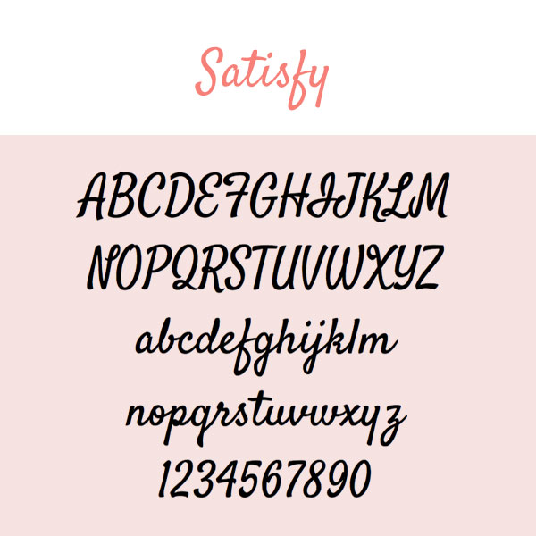
10. Satisfy
Yes, I picked a lot of scripty fonts for this boudoir-inspired collection! Satisfy is a more laid-back style of cursive. Some letters conform to the rules; some do not. Does your brand speak to the non-conformist? Try out Satisfy.

11. Yesteryear
Yesteryear is one of those fonts that reminds me of something yet I can’t quite put my finger on it. It evokes a familiarity. Déjà vu. The uppercase letters are striking. Their lowercase counterparts are delightful in their own right. Yesteryear makes a great choice for a headline that the eye will want to connect with.

12. Fredericka The Great
Does your brand tell a story … a fairytale? Do your clients leave feeling like a princess after shooting with you? If that sounds like your boudoir photography style, Fredericka is for you. Fredericka The Great looks like the text printed on an illustrated cover of a fairytale. It’s the font that will leave you feeling happily ever after. Test it out in all of the colors of your brand palette … it will not disappoint.

13. Tulpen One
Tulpen One is definitely one funky little font. Teardrop shapes differentiate this typeface, giving it an artistic and modern spin. Does your boudoir brand have a flare? Incorporate Tulpen One into your graphic designs! (Pssst…don’t be afraid to use all caps with this one!)
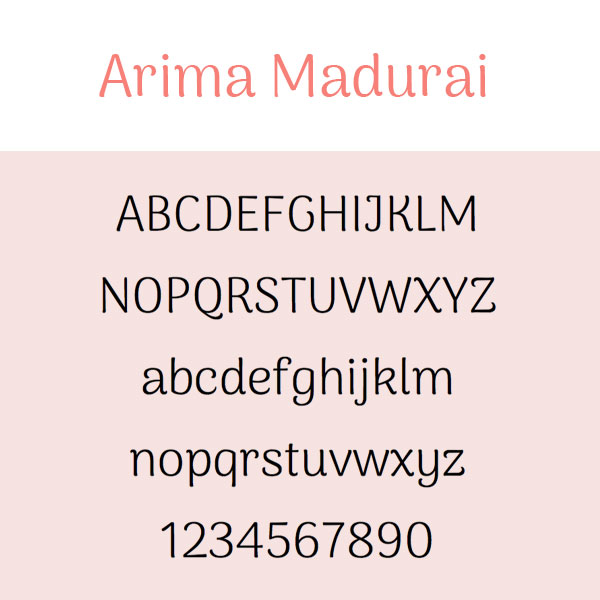
14. Arima Madurai
Arima Madurai would make for some very precious body copy text. It’s slightly whimsical yet very neat. Do you have a free guide that you give to your clients? Freshen up the design with Arima Madurai!

15. Vast Shadow
I love Vast Shadow! This font is flashy and dimensional. It’s perfect for big headlines that need to give off the WOW factor. To preserve the 3D-like effect that this font gives off, I would recommend placing it on top of either a solid or very transparent type of background.

16. Flamenco
You say Flamingo, I say Flamenco. This font is ultra cool. It’s fairly thin so I’d suggest using Flamenco for body copy. Be sure there’s good contrast between the color of the text and the background in order to let this little gem shine!

17. Zilla Slab Highlight
Highlight all the beauty of boudoir with Zilla Slab highlight. This font looks amazing in every color of the rainbow! You can use it to draw major attention to your headlines or even sub-heads. Take the Slab for a spin!
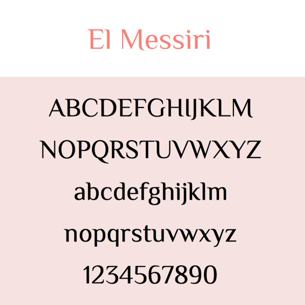
18. El Messiri
El Messiri is a pretty flexible font. Create a punchy sub-head using all caps or apply it to your body copy for that storybook kind of feel.Either way, I think you’ll have lots of fun with this one.

19. Crimson Text
Why use standard and boring fonts like Times New Roman and Garamond when you can be using a beautiful font like Crimson Text? It’s the little things that can totally upgrade the level of your marketing. Try Crimson Text for body copy text and see the difference.
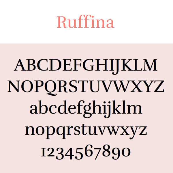
20. Ruffina
Ruffina is a gorgeous serif font that’s bold and extremely legible. There’s just something about it. Like the words in a juicy romance novel, any text written in Ruffina will leave you wanting more.
There you have it … 20 FREE Google fonts that will transform the look of your boudoir photography brand. Try ‘em and comment below with your feedback!
For more deets on downloading, embedding, or using Google Fonts, read this blog post: How To Explore & Download Google Fonts

How To Explore And Download Google Fonts
One way to really differentiate your marketing for your small business is to experiment with different fonts. Times New Roman, Arial, Garamond … those are the same old, same old. Everyone uses those. Did you know that Google offers over 900 font families that you can download and use for free? In this blog post, I’m going to teach you how to do this.

One way to really differentiate your marketing for your small business is to experiment with different fonts. Times New Roman, Arial, Garamond … those are the same old, same old. Everyone uses those. Did you know that Google offers over 900 font families that you can download and use for free? In this blog post, I’m going to teach you how to do this.
Why I love Google fonts so much.
Ok, so there are two reasons why Google fonts are completely awesome. First off, every font family in the massive library of fonts is open-source. What that means is you can download and use them any way you want … for free! Yipppeeeee!
Aside from the open-source licensing, another reason I love Google Fonts is because of the variety. The library offers a robust mix of beautiful styles that can be mixed and matched to suit any brand.
Sorting Fonts
Alright, now it’s time to take a trip over to the Google font library!
fonts.google.com
When you hit the Google Fonts main page, it will look something like this.

As you scroll through the page, you’ll realize there’s A LOT to choose from. Thankfully, you’re on a Google website and the search functionality is bar none.
On the right side of the screen, you’ll find a menu of options. This menu allows you to filter the collection based on a number of different criteria:
Categories
Serif:
In typography, a serif is a small line or stroke regularly attached to the end of a larger stroke in a letter or symbol within a particular font or family of fonts. A typeface making use of serifs is called a serif typeface. (Wikipedia) Times New Roman is an example of a serif font.
Sans Serif:
Typeface that doesn’t include the little strokes just mentioned above are referred to as sans serif fonts. Arial is an example of this.
Display:
A display typeface is a typeface that is intended for use at large sizes for headings, rather than for extended passages of body text. (Wikipedia)
Handwriting:
A handwriting font is just what the name suggests … a font that looks like handwriting!
Monospace:
A monospaced font (opposed to a proportional font) is a font whose letters and characters each occupy the same amount of horizontal space. (Wikipedia)

Image from Wikipedia
Sorting
Using the Sorting filter, you can view font families based on what’s currently Trending or the most Popular fonts. You can also filter by Date Added or put the fonts in Alphabetical order.
Languages
The majority of Google fonts are in English but there are font options in several other languages as well.
Sliders
The sliders in the filter menu are very cool. There are sliders for Number of Styles, Thickness, Slant, and Width. By moving the slider to the right on any one of these options, you’ll be presented with fonts that represent more of the particular characteristic you’re filtering. (For example, if you moved the slider all the way to the right on the Thickness option, you’d see the thickest fonts in the library.)
A Note about Number of Styles:
Some fonts are offered in varying styles. For example, the font Arima Madurai is offered in eight different styles ranging from Thin all the way to Black. Depending on how you’ll be using a font, you may want to consider downloading multiple different versions of it.

Choosing Fonts
The Google font library, even with its amazing filtering capabilities, can be a tad overwhelming. How does one choose a font with all of these incredible options?! Well, my advice is to explore the library and click on the fonts that speak most to you (and, of course, speak to your small business brand). I personally have a thing for sans serif and handwriting style fonts. 🤓
If you click on a font that you like, you’ll be brought to a details screen, which looks like this:

In this example, I had clicked on the font called Satisfy. The details screen shows all of the characters in the collection and even lets you type in sample text so you can see what different words or phrases will look like written in the font!
To view sample text, simply click where it says “Click here to preview text.” (This is found in the middle of the page underneath Styles.)
After you type your text, you can use the red slider to change the size of it. In my example, I bumped the point size up to 90 so I could see what my text would look like as a big headline. 🍍😊

On the left side of the screen, you’ll see a menu of fonts that will pair nicely with the font you’ve selected. By clicking on any one of these options, the paragraph text to the right of it will change to that particular font. It’s a great way to see how other fonts will coordinate with your selected font … which helps narrow your search, too!

How To Download Fonts
Once you’ve selected a font that you like, you can go ahead and add it to your collection to download! To do this, simply click the little red plus icon. (It will be at the upper right corner of the details page or to the right of each font listed on the main page.)
Each time you select a font, it will be added to your collection. The collection will remain in an expandable box at the bottom right of the page as long as you have fonts selected. To access your collection, click the minus sign on this expandable box.
When you expand the collection, it will look something like this:

To download the font(s) in your collection, simply click the icon that looks like a down arrow with a horizontal line underneath it (it’s in the top right corner of the box). A zipped folder will then be downloaded to your computer.
If you’re on a Mac, you can double click the zipped folder to unzip it. Then open the unzipped folder and double click the font file. This will trigger your Font Book to open. Click Install Font and BOOM! The font is installed and ready for you to use!
Happy font browsing! Comment below and let me know what you download. :)
Need a small business brand identity?


Creating A Small Business Brand From Scratch
One of my favorite types of projects is small business brand design. The creation of something sparkly and new … it’s very, very exciting! If you’re thinking about starting up a new venture or rebranding your current business, then keep reading! In this blog post, I’m going to share the steps I take to create a small business brand from scratch.

One of my favorite types of projects is small business brand design. The creation of something sparkly and new … it’s very, very exciting! If you’re thinking about starting up a new venture or rebranding your current business, then keep reading! In this blog post, I’m going to share the steps I take to create a small business brand from scratch.
Before doing a cannonball into the sea of fun stuff, the very first step in the brand design process is creating your buyer persona(s). Who exactly is it that you’ll be marketing your brand to? This is extremely important because the tone, style, and feel of your brand must … without a doubt ... resonate with that person.
Step 1: Create your buyer persona!
“A buyer persona is a semi-fictional representation of your ideal customer based on market research and real data about your existing customers.” -HubSpot
When creating a target buyer persona for your small business, here are some things you’ll want to identify:
Their name
Their age
Where they live
Their relationship/family status
Their education level
Their occupation
Their annual income
Websites they like / what blogs or YouTube channels they subscribe to
Magazines or books they like to read
Podcasts they listen to
Their hobbies
Brands they like
Social media platforms they spend time on
TV shows they watch
When writing the profile for your persona, it’s important to get as specific as possible. When you’re crystal clear on who it is you’ll be marketing to, the marketing part becomes a whole lot easier!

Need help completing this exercise? Download our free client persona builder!
Once you know exactly what your dream client looks like, you’ll never make the mistake of taking on (or marketing to) a nightmare client again. Download our FREE Client Persona Builder tool today.
After your target buyer persona has been developed, read the profile over a couple times. You’ll want to have your character front and center in your thoughts as you move through each of the next phases in the brand design process.
Set The Mood
I begin every small business brand design project with a mood board on Pinterest! Remember back in the day when you used to make those colorful collages out of magazine clippings? You’d forage your favorite publications for photos, words, or quotes that inspired you and then excitedly glue them to a poster board. (Yeah, I deeply miss the days before technology took over everything. 😭) Well, think of a Pinterest board as that old school poster board!
Create a new Pinterest board and, keeping your target buyer persona in mind, start searching for all the inspiring things. It literally doesn’t matter what it is. If you see something that you think would strike a chord with your buyer persona, Pin it to that board, baby! Pin until your little heart’s content.
Pin all the inspiring things!
When you feel like your board is filled with awesomeness, take a step back and look at it as a whole. As you scroll through and relish your Pins, make a list of any themes that stand out to you ...
Colors
Font styles
Objects
Words
Shapes
Etc., etc.
If you see any patterns on your board, be sure to write them down!

Side Story:
I love interior design. All my friends know this and often seek my advice on decorating their homes. A few years ago, my friend Kim was struggling to decorate her townhouse. She would go to Homegoods, for instance, and try to find things that all matched a certain color palette she thought she wanted. When she got the stuff home, she realized that she hated it and would then return everything. It was a vicious cycle.
One day she was sharing her style struggles with me and I gave her this advice:
Just buy the stuff you like and don’t overthink it. It will all come together because it’s your style.
I’m going to give you this same advice for your Pinterest board. Pin all the things you think your buyer persona would like and don’t overthink it. You’ll be amazed at how everything does in fact come together and the unique themes that will be born from it. It worked for Kim and it will work for you, too.
Picking A Color Palette
I freaking LOVE this part of the brand design process! Picking a color palette gives me immense joy … I’m very weird like that. Here’s how I suggest you do it.
Scroll through your Pinterest board and find one picture that totally stands out to you. A photo that gives you a fantastic vibe when looking at it. Save the photo on your computer and then head on over to the HTML Color Codes website.

Click the blue Upload File button and upload the inspirational image you just saved. As you hover your mouse over different areas of the photo, you’ll see the swatch in the upper right section of the box start to change.
In my example, I want to choose an orangey-pink hue from that beautiful bouquet.

Click on a color you like and, voilà! You’ll see the HTML color code for it appear in the lower right section of the box. If you see a hue within the color swatch that you also like, you can click directly on it to get the code.


Go through your image and select five or six colors from it. Be sure to jot down the HTML color codes for each.
(Pro Tip: I like to type my codes into a Note so I can easily copy and paste them when needed.)
Here are the colors I picked from my photo:
#FB4448
#D0C6E1
#EBE1DF
#179151
Next, go to Canva.com. Canva is a free online tool for creating graphics. If you don’t already have an account, you’ll need to set one up. I use the free version of Canva all the time and highly recommend it! (There’s a paid version that offers more features if you’re interested!)
Once you’re in Canva, click the Create A Design Button and then choose Instagram Post. We’re going to make 1080x1080 pixel swatches of the colors we picked out of our inspiration photo! To do this, click the Elements button on the left side menu and then type Square into the search box. Click on any solid (Free) square image that you want.


The image you choose will appear in the white box. Resize the square so it fills the entire white space. Then click the little square color swatch that is sitting above it. A menu will open and you’ll want to hit the + option. This will allow you to change the color of the square to one of the colors you selected from your inspiration photo. All you have to do is enter one of the HTML color codes you jotted down and the box will magically change to that color!


Next, click on the Text button in the left side menu. Click on Add A Heading and a text box will appear in the middle of your color swatch. Click into that text box and type the HTML Color Code you used to make that swatch. Think of this step as creating those paint swatches you’d get at Benjamin Moore. (If you want to get really geeky (like me 🤓), you can also make up a name for your color.)

Click the Copy Page icon in the upper right (it looks like two pages overlapping each other) and repeat the process above for all of your colors! (Just click on each design element to make your changes to it.)

When you’re finished making all of your color swatches, go ahead and download them to your computer. Click the Download button that’s at the very top right corner of the screen, then choose Download from the menu. For File Type choose .jpg and for Select Pages choose all your pages. Click Download.
A zip folder will be created of all your images. You can unzip the folder and save the images to any location on your computer.

My Palette


Designing A Logo
Now that you officially have a color palette, you can move onto the logo design phase. In this section, I’m going to teach you how to design a simple logo using Canva. Before we get started, let’s quickly review the elements of a good logo:
Simple and timeless works best.
Logos with overlays and background imagery do not translate well across different printing applications. Your logo should be versatile and have the ability to be placed on a variety of back drops without losing its integrity.
Ok, now it’s time to jump back into Canva. Click on Create A Design and then choose Logo. I like to start with the text and then build my other design elements around it. So go ahead and click the Text option in the left side menu, then click Add A Heading.

Replace the placeholder text with your business name by simply clicking into the text box, deleting the placeholder, and typing in your business name.
If you look above the canvas, you’ll see a white menu running across. The very first option is fonts. With your text highlighted, play around with some different font styles until you find one you like the best. (Note: Think back to your Pinterest inspiration board. Was there a font style that stood out to you? Try to pick something similar!)

There are MANY fonts to choose from so take your time and have fun with this step however, do not overthink it! Just make sure that whatever font you go with is easy to read. (Think about scaling it down to business card size. How would it look?)
To change the color of your text, highlight it and then click on the A icon in the top menu. Click the + and then enter in one of your HTML Color Codes.

Moving along to adding some design elements (This step is optional. If you want your logo to just be plain text, that’s totally cool).
Click on Elements in the left side menu and go crazy ... but not too crazy. I recommend sticking to basic shapes and lines; nothing too intricate.
As you add your design elements, you can resize them and change the colors using the same steps we used for making our color swatches. Be sure to stick to the HTML colors in your palette.
Tip: If you need to arrange elements behind or in front of one another, click on Position in the top menu and choose either Forward or Backward.

After you’re done creating your masterpiece, download it as either a .png or .jpg file. (If you want to preserve transparency, you’ll have to upgrade to a paid version of Canva.)
BOOM! You officially have a brand design!


Make sure you create a branding doc that outlines all of your HTML Color Codes and fonts so you can always have it for reference.
Finally, one last thing to mention: HTML colors are for the web. If you plan on printing your logo/colors, you’ll need the equivalent PMS color codes. (PMS stands for Pantone Matching System.) To get these, visit Code Beautify. Enter each of your HTML color codes into the HEX field and choose 48 for the distance. Look through the PMS swatches that appear and take note of the one that most closely matches each HTML color. Add this info to your branding doc!
If you follow these steps to design your small business brand, hit me up and show me your design!
-J
Need help branding your small business? Let us do the heavy lifting!

Tuesday Tip #3: Use Fabulous Fonts
Fonts are the pinnacle of great design. So explore them. Use them. Get wild with them! There’s an abundance of free fonts out there, available for you to download and use in your marketing! …

Fonts. Oh how we love you! You can be fun, creative, dramatic, silly, or sarcastic. You can deliver a vibe without using many words at all. You are a style of artwork that we can never ever get enough of.
Yes, fonts are the pinnacle of great design. So explore them. Use them. Get wild with them! Don’t fall into the trap of thinking that Impact, Papyrus, or … dare we even say ... Comic Sans (eeeeeek!) are the only options you have to work with. There’s an abundance of free fonts out there, available for you to download and use in your marketing!
HubSpot recently shared a list of 15 Of The Best Calligraphy Fonts You Can Download For Free. You can check it out here.
Remember, your font choice speaks volumes so choose wisely. Differentiate your marketing by using fabulous fonts!
Every Tuesday we share easy and actionable advice you can take to refresh your current marketing plan. Follow us on Facebook and Instagram to see more!